Thursday, April 1, 2010
Closing Post
So this is the end ! Working on this project has been GREAT! We all had a blast. Hope you like our blog which we are proud to say is now officially CLOSED!!!!!
Tuesday, March 30, 2010
Reflections on Final Footage
We were generally pleased with our final opening sequence as we thought there was good continuity, style, theme and music - which was backed up by our audience feedback
However, some feedback we got suggested that the point/anchorage of our footage wasn't very clear which left people confused and disinterested. Also not everyone understood what had happened (thought the man was drunk rather than dead)
In addition to this the dissolve could have been better if we had more time to tweak alter how we editied it or shot more suitable footage (that would have been easier to layer up).
"The music and paced made it seem really creepy"
However, some feedback we got suggested that the point/anchorage of our footage wasn't very clear which left people confused and disinterested. Also not everyone understood what had happened (thought the man was drunk rather than dead)
"I didn't understand that - it was a bit boring"
In addition to this the dissolve could have been better if we had more time to tweak alter how we editied it or shot more suitable footage (that would have been easier to layer up).
Monday, March 29, 2010
Titles
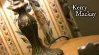 We wanted to keep our titles quite simplistic in order to be in keeping with our indie / art-house style. As a lot of our shots were artistically framed - there was quite a lot of room or space in which to place the name titles. However we did think about title placement when making our story board such as the black back of the head shot and our other early cutaways.
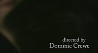
 The last title had is crucial as it's the name of the film. This is why we wanted to keep it a strong but simple black and white - to be similar to our other titles. However it looked a bit dull and insignificant, so we added the smudge effect and put it lowercase (which is an alternative idea and makes it ambiguous as to whether we mean the vowel or the name).
We came up with the idea of Reverse Pictures as it is going against or REVERSING mainstream film. This gave us inspiration for our logo (the reversed R). We tried to do a fancy title opening- but found it want in keeping / didn't match the independent alternative brand or company, which is why we ran with the mirror image animation. This also reverses the writing to link with the company name.

Monday, March 22, 2010
Filled In Shot Log
Each shoot we had, we filled in a shot log to help us capture our shots during editing. This is the first of three pages from our final shoot, typed up:
Wednesday, March 10, 2010
Second Shoot Feedback
- Glass could have a bit of wine in it
- Actor possibly needs to look dead (make-up? open eyes?)
- Show that there's been more of a struggle (move large cushions? torn / stained dress? cracked / broken glass?)
- Concentrate on continuity particularly at the match-on action moments
- Have the right actor and keep his eyes open to make him look dead
- Have less action
- Pace could be better?
Saturday, March 6, 2010
Reflections on Second Shoot
Although our real actor wasn't available on this shoot we had to test out some shots. The shoot went quite well on the whole:
+ Again, we finished earlier than expected. We tried a few variations of shots in the spare time.
+ We were more creative this time around, shooting each shot at different angles and distances.
- In addition to the dialogue we recorded the dialling tone and the person answering the phone separately to see if the sound will be clearer than before.
- We managed to turn the distracting light in the background off for most of the shots, but we forgot sometimes.
We now have to edit this into a second rough cut and figure out what we need to improve for the final shoot!
Thursday, March 4, 2010
Preparation for the second shoot
Aims
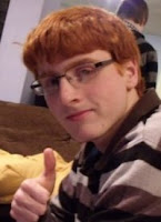 We have a slight disruption as our actor is no longer available on weekend. We will see if he can do very early in the morning on weekend or before school on a weekday.
 We have a slight disruption as our actor is no longer available on weekend. We will see if he can do very early in the morning on weekend or before school on a weekday.
 - If he can't do it - we will use a stand-in actor (see picture) for the weekend in order to practice our new shots and then re-shoot the following weekend
- Shot list storyboard etc. - what we will test out etc.
Tuesday, February 23, 2010
Evaluation of rough cut and Changes to be made
Reflections / Things to Do on the Real Shoot
- Synchronise the beginning of the sequence to the music
- Film everything for longer, especially the cutaways at the beginning to help create a slower continuity sequence
- Film the pans steadily (so they can be slowed down in editing)
- Shot of Dawn looking at the dawn outside window
- Signifiers of what caused the struggle / death throughout sequence (moved furniture/stain/wine or broken glass on the floor)
- Remake music so that it fits (start from beginning after the bass)
We have changed our storyboard, shot list and props list to compensate for the longer shots and the altered setting (messier to signify a fight)
Monday, February 22, 2010
Rough Cut Feedback
Feedback from DYM
-Face reveal before body
-Beam of light makes her snap out of it
-Less shots at the beginning, but each shot lasting longer
-Dissolve montage at beginning of sequence
-Dissolve > abstract body / leaning forwards > cutaways
-Some cutaways aren't necessary e.g. furniture
-Signifiers as to the cause of the fight
-How does he die? Wouldn't the bottle have broken?
-Narrative details need to be addressed; murder weapon, etc.
Feedback from BLK
-Phone sequence is good
-Nice music
-Nice acting
-Some nice shots
-Liked the story
-Every arty shot must have purpose / ending / reward use more camera movements to create flow
-Reveal murder weapon e.g. after lamp, run-on to him or glasses
give reveal for glass shot and window shot
-Idea of having her mundane activities, pat down cushion, pick up glass, look out window, look at watch - emphasise dawn
-Possibly sit back down, fade to black, come up again whilst she's still sitting - shows passing of time
-Lighting get rid of harsh ceiling light
Friday, February 12, 2010
Behind The Scenes of our First Test Shoot
On our first test shoot, I brought my own camera and tripod to film some of what went on behind the scenes. This is just one of the shots we took.
Thursday, February 11, 2010
Reflections on Test shoot 1
+ We'd done all the shots we planned to do with time to spare! So we improvised some shots at the end of our 2nd 4 hour session. This should give us more variety and options when editing.
+ Our actor Nima quickly understood what he had to do and we got his shots over and done with pretty quickly.
-We filmed the dialogue and the person answering phone with 'Hello?' using the shotgun microphone on the camera but they may not have come out clearly.
- For the curtain shot we needed the light outside to be bright, we thought this would be earlier in the day but in fact it was brightest around midday.
- Also as we only used the paglights some of the time, this may affect continuity . We'll have to be more wary of lighting issues for the next shoot...but we'll find out what we need to change once we've edited the sequence!
Wednesday, February 10, 2010
Test Shoot Breakdown
-Arrived at location and set up the scene, thought about lighting and tried out a shot
-Actor arrived, explained expectations and aims, did all his shots first
-Did the last sequence and phone shots from different distances
-Had a break for lunch
-Finished off all our storyboard shots
-Did quality control for all our shots so far and recharged camera
-Started experimenting with cutaways and new shot ideas
-Re-did lighting shot and added in reaction cutaway
-Did another quality control
-Checked there was nothing more to add improve or do and checked our equipment and packed away carefully
In this test shoot we wanted to test out the arty style of our idea and experiment with creative close ups and framing. We also wanted to test out our idea of a dissolve in editing so took a shot with that idea in mind. We also played around with the manual focus.
We will later test out these theories/shot types in editing and then improve them or scrap them for when we do our re-shoot.
Monday, February 8, 2010
Thursday, February 4, 2010
Group Meeting 4 - 04/02 - 30 Minutes
Although we already had our group meeting this week on the Tuesday 2nd February, we decided that we needed another group meeting to finalise our initial script and prop / costume lists.
Below is the first draft of our script:
Below are the props and costume lists for what we will need in the test shoot:
Below is the first draft of our script:
Below are the props and costume lists for what we will need in the test shoot:
Tuesday, February 2, 2010
Group Meeting 3 - 02/02 - 60 Minutes
In this meeting, we felt as though we really had to start drawing our storyboard and preapre for our test shoot. We had secured our actor, location and equipment hire. we now need to do a shot list and storyboard of what specfic shots we are going to shoot such as:
Pan across body and floor
Pan across body and floor
Tilt up from foot to knee
Above, the pink rectangle is a stand-in title. As it is an opening sequence we thought it was best design some shots with the intention of outting titles on them - so it was important to leave space.
Thursday, January 28, 2010
Proposal Re-presentation
Genre
Our film’s genre is psychological thriller, examples from this genre include Se7en, Rear Window and Silence Of The Lambs which focus on creating fear through tension as opposed to blood and gore.
Our film’s genre is psychological thriller, examples from this genre include Se7en, Rear Window and Silence Of The Lambs which focus on creating fear through tension as opposed to blood and gore.
Opening Sequence
It is dawn. There is a girl with blood on her in the middle of the room on a chair with a dead body at her feet. She is rocking slightly to show that she is thinking hard. We would introduce this scene with slow close up tilts and tracks along the body, her hands, the chair, her face etc whilst showing the titles in the area of space (e.g. first title of the back of the head of the dead body). About half way through the mood will suddenly change and she will get up suddenly. She will become very ‘matter of fact’ about how she is going to dispose of the body (kick the body to see if its dead get bin bags etc). The sequence could end with a phone call to a friend, on the line "I need your help."Outline of the film
The dead body is a character who she knows but isn’t really connected to, he gets drunk and violent at her home, and she kills him in self defence. She’s up all night trying to figure out what to do. OPENING SEQUENCE. The rest of the film is about how trying to hide the body and the secret leads to her killing others.
After some clarification of what lead up to the event (in the sequence) this proposal was signed off - which is good as we are now able to start working out practicalities of shooting and start composing a storyboard for our upcoming test shoot.
Proposal and Feedback
Using our blog as a visual aid, we proposed our idea to the group and gave out the following handout to summarise:
Feedback:
+ Arty elements
+ Idea of the morning after
Character Issues:
- What was her motive - is she crazy?
- Who is the antagonist?
- Idea of her doing normal things didn't go down well - as it seemed like she had no reaction
Narrative issues:
- Unclear on the rest of the film and the sequence of events
- Will there be an investigation?
- When is the body revealed?
Practical issues:
- Room issues
- Rethink choice of male actor
We're re-presenting on Friday, periods 4 and 5!!! This is because our idea seemed to vague and whilst they liked the general idea/style of it - the plot details and action codes needed to be more specfic.
Wednesday, January 27, 2010
Character Profile
Dawn
-18 years old
-Lives with 3 housemates in London
-Is a studying English at university
-Is quite a structured logical person
-Enjoys socialising and going out
-Hopes to be a teacher
-Is quite naive and optimistic (begins to change in film)
-This killing starts the ball rolling on a bad sequence of events - which is the rest of the film
Target Audience
Our target audience for this film would be:
- People who enjoy and watch psychological thrillers (and other thrillers)
- Students who are a similar age to the main protagonist
- Young women
- British film fans
- Slightly alternative audiences (who like something local, new and innovative as an antidote to high budget blockbusters)
Typical murderers/villains in Thrillers
-Older white male
-Very clever but not very strong
-Bit psychotic making them scary and creepy
-Pre-meditate murder with every, detail planning, extremely carefully - taking everything into account
-Identity not fully exposed (shadows, enigma, sometimes revealed near the end)
-Cut off from society or isolated
We would like to break these stereotypes by having a murderer who is:
-Young female student
-Spur of the moment murder, without thinking about consequences or what to do with the body
-Quite a normal everyday member of society (friends, flat, job)
-Introduced like any other character, with information about lifestyle (not shadows or hidden faces)
Tuesday, January 26, 2010
Soundtrack Research and Ideas
Music is an important part of a thriller; it makes the genre clear and anchors the mood of a sequence. Although we haven't considered any specific music for our opening sequence, we think that something similar to the following would be appropiate:
Monday, January 25, 2010
25/01 - Group Meeting 2
Decisions made:
- The idea of the party wasn't too necessary to the plot so we scrapped it, it was only to make it more contemporary which could also be done by including modern technology, up-to-date costume, etc.
- We could keep the scene looking messy due to a fight between the girl and boyfriend. This would indicate something is wrong to the audience.
- We decided that the body should remain in the same room as the room where the girl wakes up (in the living room) and possibly make him in the sequence from the very beginning. The camera could focus on the girl for the sequence which would make the audience wonder why we don't get to find out who he is (until the blood makes it obvious that he is dead).
- Alternatively, he could be partially hidden by a prop, e.g. underneath a table, lying behind a sofa, etc. Shots would have to be constructed carefully to keep him hidden. The body doesn't have to be in every shot, he could be completely out of shot for most of the sequence until the end.
- We don't think the girl would do anything too different in terms of behaviour, she could still be cleaning up and generally denying the body's existence.
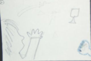
Thinking about shots we could use to show the body to the audience, we decided to all sketch some ideas:
We discussed some questions:
How do we tell the audience the relationship between the girl and the dead boyfriend? Our best idea was to show a photograph of the boy and girl with the boy wearing a paticular prop (possibly a watch) and then cut to a shot of the boyfriend's prop that has been broken to symbolise the change from his life to death.
We considered where the girl should wake up at the start of the sequence and how it should be shot. On a couch? On the floor? In a chair? We think that if she started on the floor, it would be symbolic of the fact that she can't get any lower (literally and morally) so it would be best. Perhaps, later on in the sequence, there would be a shot of the girl sitting in the chair to make her look eerily calm.
At the start, to create a false sense of equilibrium, we could have a pan of several unbroken photographs of the boy and girl (on a cabinet, shelf, wall, possibly.)
We will keep thinking of ideas for shots and narrative and continue with research into opening sequences.
25/01 -Teacher Feedback
As we explained our idea to our teacher, it became clear that our idea was too complicated. So we considered omitting the party element of the narrative and to reveal the body sooner to the audience. We also decided to discuss what the relationship between the girl and deceased boyfriend would be. We decided to answer the following in our meeting:
- Should the narrative occur after a party?
- Should the body be revealed to the audience sooner than the last shot?
- How much will the girl acknowledge the body?
Sunday, January 24, 2010
Saturday, January 23, 2010
Researching 'Art-House' Visuals
After we had settled on our idea, we very quickly decided on filming and editing it in an unusual, 'arty' way that would show the main character's mental confusion and emphasise the fact that the idea goes against conventions.
We decided to find examples of media that used a similar style to what we aiming for. Below are some examples that we liked.
Short Depth Of Field - from the TV Drama, Misfits
We decided to find examples of media that used a similar style to what we aiming for. Below are some examples that we liked.
- Can be used to represent a character's separation from everything else.
- Can be used to hide details in the background (or foreground)
- Creates a clear sense of distortion and possibly surveillance
- Creates a sense of time passing
- Clearly distorted and has a dream-like quality to it
- Represents that it is the daytime (morning / afternoon)
- Can have a dream-like quality if overused
- Creates a sense of distortion
- Can be used to make normal subjects look unusual / abstract
- Can be used to hide the rest of a subject (or make it hard to work out what the subject is)
- Makes the viewer feel uneasy
- Can signifiy a character's instability
Friday, January 22, 2010
Analysis for the opening sequence of Memento (Nolan, 2000)
+ Iconography - bullet & glasses on the floor, blood, picture of the dead person
+ Character - LA of the main character makes him look dominant and menacing, esp. as the gun flies into his hand
+ Music - enigmatic, sad, tense
+ Enigma: picture developing is played backwards, and we realise the sequence of events is backwards
+ Titles - slow and fading in and out
Analysis to the Opening Sequence of Insomnia
Conventions or Techniques used in this opening:
-Use establishing shot to set the scene (wide pan over icy waters)
-Have simple titles (black and white, simple font) that fade in and out and overlap
-Have blurred focus on some shots and titles
-Have extreme close ups (which are enigmatic and slightly disorientating)
-Simple masculine white, black and blue colour scheme
-Red blood to signify horror/thriller genre
-Music - tense, long notes, threatening, builds up, bass, increasing beat/pace, no dialogue
22/01 - Group Meeting 1
After our first meeting, we made significant progress:
We discussed psychological thrillers and thought it may be challenging but we could still use elements of the sub genre in our thriller. We talked about 'The Shining' as an example of seeing things that aren't real.
We briefly considered the STYLE: 'arty', unconventional to thrillers, out of focus shots.
The rest of the film would be about the girl's struggle to cope with and hide what she has done.
We decided on this idea as its practical (filmed in 1 house/ room where we can experiment with lighting etc) and it works to our strengths.
In our next group meeting we will put forward ideas for the development of the structure and narrative of the opening sequence as well as any shot ideas.
- We discussed our individual original ideas.
- We talked about our film and TV influences for our ideas.
- We chose one idea which we will now develop into our main project.*
- We talked about the plot of the rest of the film.
- We considered whether or not our idea would work with the brief.
- We made some decisions about our opening sequence's style.
We decided to run with Kerry's idea of a young girl killing her boyfriend after a big party and discussed films and TV shows that could influence both the technical and narrative aspects of our sequence such as Criminal Justice, Hard Candy and Insomnia.
We wanted to do something different to thrillers that we've seen and agreed that starting the sequence on the morning after the crime had been committed is a good idea and that it's also similar to the opening of 'Se7en'.
The rest of the film would be about the girl's struggle to cope with and hide what she has done.
We decided on this idea as its practical (filmed in 1 house/ room where we can experiment with lighting etc) and it works to our strengths.
In our next group meeting we will put forward ideas for the development of the structure and narrative of the opening sequence as well as any shot ideas.
Subscribe to:
Comments (Atom)


.bmp)

