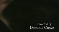
 We wanted to keep our titles quite simplistic in order to be in keeping with our indie / art-house style. As a lot of our shots were artistically framed - there was quite a lot of room or space in which to place the name titles. However we did think about title placement when making our story board such as the black back of the head shot and our other early cutaways.

 The last title had is crucial as it's the name of the film. This is why we wanted to keep it a strong but simple black and white - to be similar to our other titles. However it looked a bit dull and insignificant, so we added the smudge effect and put it lowercase (which is an alternative idea and makes it ambiguous as to whether we mean the vowel or the name).
We came up with the idea of Reverse Pictures as it is going against or REVERSING mainstream film. This gave us inspiration for our logo (the reversed R). We tried to do a fancy title opening- but found it want in keeping / didn't match the independent alternative brand or company, which is why we ran with the mirror image animation. This also reverses the writing to link with the company name.

No comments:
Post a Comment