Our Final Sequence

Tuesday, March 30, 2010

Reflections on Final Footage

We were generally pleased with our final opening sequence as we thought there was good continuity, style, theme and music - which was backed up by our audience feedback
          
"The music and paced made it seem really creepy"

However, some feedback we got suggested that the point/anchorage of our footage wasn't very clear which left people confused and disinterested. Also not everyone understood what had happened (thought the man was drunk rather than dead)

"I didn't understand that - it was a bit boring"

In addition to this the dissolve could have been better if we had more time to tweak alter how we editied it or shot more suitable footage (that would have been easier to layer up).
Monday, March 29, 2010

Titles

We wanted to keep our titles quite simplistic in order to be in keeping with our indie / art-house style. As a lot of our shots were artistically framed - there was quite a lot of room or space in which to place the name titles. However we did think about title placement when making our story board such as the black back of the head shot and our other early cutaways.           


The last title had is crucial as it's the name of the film. This is why we wanted to keep it a strong but simple black and white  - to be similar to our other titles. However it looked a bit dull and insignificant, so we added the smudge effect and put it lowercase (which is an alternative idea and makes it ambiguous as to whether we mean the vowel or the name).

We came up with the idea of Reverse Pictures as it is going against or REVERSING mainstream film. This gave us inspiration for our logo (the reversed R). We tried to do a fancy title opening- but found it want in keeping / didn't match the independent alternative brand or company, which is why we ran with the mirror image animation. This also reverses the writing to link with the company name.

Editing Techniques

Below are some of the editing techniques we used in our seqeunce(s):


Monday, March 22, 2010

Questionnaire

This is our questionnaire to give out during our opening sequence's screening.

Filled In Shot Log

Each shoot we had, we filled in a shot log to help us capture our shots during editing. This is the first of three pages from our final shoot, typed up:
 

Wednesday, March 10, 2010

Second Shoot Feedback

  • Glass could have a bit of wine in it
  • Actor possibly needs to look dead (make-up? open eyes?)
  • Show that there's been more of a struggle (move large cushions? torn / stained dress? cracked / broken glass?)
Therefore when we re shoot we will make sure to:
  • Concentrate on continuity particularly at the match-on action moments
  • Have the right actor and keep his eyes open to make him look dead
  • Have less action
  • Pace could be better?

Saturday, March 6, 2010

Reflections on Second Shoot

Although our real actor wasn't available on this shoot we had to test out some shots. The shoot went quite well on the whole:

+ Again, we finished earlier than expected. We tried a few variations of shots in the spare time.
+ We were more creative this time around, shooting each shot at different angles and distances.

- In addition to the dialogue we recorded the dialling tone and the person answering the phone separately to see if the sound will be clearer than before.
- We managed to turn the distracting light in the background off for most of the shots, but we forgot sometimes.

We now have to edit this into a second rough cut and figure out what we need to improve for the final shoot!

Thursday, March 4, 2010

Preparation for the second shoot

Aims

We have a slight disruption as  our actor is no longer available on weekend. We will see if he can do very early in the morning on weekend or before school on a weekday. 
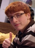
  • If he can't do it - we will use a stand-in actor (see picture) for the weekend in order to practice our new shots and then re-shoot the following weekend
  • Shot list storyboard etc. - what we will test out etc.