Thursday, April 1, 2010
Closing Post
So this is the end ! Working on this project has been GREAT! We all had a blast. Hope you like our blog which we are proud to say is now officially CLOSED!!!!!
Tuesday, March 30, 2010
Reflections on Final Footage
We were generally pleased with our final opening sequence as we thought there was good continuity, style, theme and music - which was backed up by our audience feedback
However, some feedback we got suggested that the point/anchorage of our footage wasn't very clear which left people confused and disinterested. Also not everyone understood what had happened (thought the man was drunk rather than dead)
In addition to this the dissolve could have been better if we had more time to tweak alter how we editied it or shot more suitable footage (that would have been easier to layer up).
"The music and paced made it seem really creepy"
However, some feedback we got suggested that the point/anchorage of our footage wasn't very clear which left people confused and disinterested. Also not everyone understood what had happened (thought the man was drunk rather than dead)
"I didn't understand that - it was a bit boring"
In addition to this the dissolve could have been better if we had more time to tweak alter how we editied it or shot more suitable footage (that would have been easier to layer up).
Monday, March 29, 2010
Titles
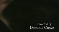
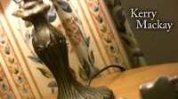 We wanted to keep our titles quite simplistic in order to be in keeping with our indie / art-house style. As a lot of our shots were artistically framed - there was quite a lot of room or space in which to place the name titles. However we did think about title placement when making our story board such as the black back of the head shot and our other early cutaways.
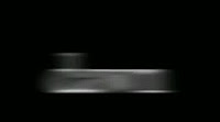 The last title had is crucial as it's the name of the film. This is why we wanted to keep it a strong but simple black and white - to be similar to our other titles. However it looked a bit dull and insignificant, so we added the smudge effect and put it lowercase (which is an alternative idea and makes it ambiguous as to whether we mean the vowel or the name).
We came up with the idea of Reverse Pictures as it is going against or REVERSING mainstream film. This gave us inspiration for our logo (the reversed R). We tried to do a fancy title opening- but found it want in keeping / didn't match the independent alternative brand or company, which is why we ran with the mirror image animation. This also reverses the writing to link with the company name.

Monday, March 22, 2010
Filled In Shot Log
Each shoot we had, we filled in a shot log to help us capture our shots during editing. This is the first of three pages from our final shoot, typed up:
Wednesday, March 10, 2010
Second Shoot Feedback
- Glass could have a bit of wine in it
- Actor possibly needs to look dead (make-up? open eyes?)
- Show that there's been more of a struggle (move large cushions? torn / stained dress? cracked / broken glass?)
- Concentrate on continuity particularly at the match-on action moments
- Have the right actor and keep his eyes open to make him look dead
- Have less action
- Pace could be better?
Subscribe to:
Comments (Atom)


.bmp)
